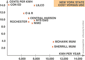
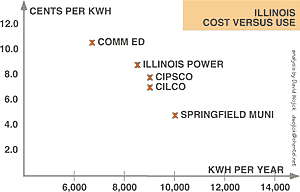
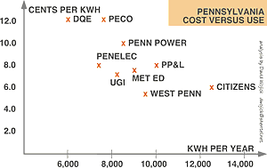
Cost Versus Use Diagrams |
WHY NOT STOP USING COAL? | HOME | HELP | WEBMASTER | SITE MAP
©1998 byDesign and PowervisioN for The Greening Earth Society—703.907.6168
|
||||||
 |
||||||
 |
||||||
 |
As the price for electricity (in cents per kilowatt hour) goes up, the amount people use (in kilowatt hours per year) goes down. These charts are for residential use. | |||||
|
WHY NOT STOP USING COAL? | HOME | HELP | WEBMASTER | SITE MAP
|
||||||